
A Little Amateur Cartography
“If you don’t know where you’re going, any road will get you there.”
While this is not strictly a photography project, it is sort of related to what I do as a photographer and artist. After reading one of my earlier travel blog articles (an account of my trip through Ladakh, India), a friend suggested that I add a map to help readers take the journey with me. When I wrote another post about a recent trip to Iceland, he reminded me of it once more, and I promised him that this time I would do it.
The easy thing to do, of course, would be to have Google Maps generate an outline of my road trip around the country and simply save an image of the output and post it to my blog. Most maps these days are made digitally, with 3D effects, customised details, satellite imagery and GPS data. But I decided that instead of downloading a map from the web, I'd make a project out of it. I was going to do it the hard way – by hand. While I do not consider myself a serious cartographer, making maps by hand the old-fashioned way does bring together my love of drawing, sketching, watercolours and (in this instance, at least) photography.
I've always loved maps. Not so much the functional ones that help one get from A to B, but the ones that captivated me as a child, of faraway places I had never been to, of imaginary worlds I could lose myself in. I took inspiration from the work of others, from maps of Middle Earth from The Lord of the Rings, from Kevin Sheehan's beautiful hand-drawn masterpieces (in particular, the whisky map of Scotland), from resources like the impressive Cartographer's Guild and the websites and blogs of several professional and amateur mapmakers. Another source was a wonderful National Geographic article about school projects in early 19th century America. I'm amazed by the artistic talent and penmanship of the young students of that era. I like the idea of hand-drawn maps that free the mapmaker from the encumbrances of exact scale and topographical accuracy, and allow him some artistic license to throw in a few touches of his own without compromising on the necessary details that help the reader/viewer understand what the mapmaker is trying to convey. And if it turns out to be a pretty work of art, well then, that's just the icing on the cake.
I've always loved maps. Not so much the functional ones that help one get from A to B, but the ones that captivated me as a child, of faraway places I had never been to, of imaginary worlds I could lose myself in.
First of all, I needed an outline. I decided to use Fabriano 300 gsm cold-pressed, fine-grain, acid-free paper for this project since I had already decided I would use a combination of pen and ink details and watercolour. I drew a reference grid on which I sketched an outline of Iceland that I had downloaded from the web. Next, I pencilled in the various locations we visited and the route we took around the country, after which I added some topographical details to give the map some character. Some mountains, particularly in the north and east of the country, as well as some (random, and not based on any accurate oceanographic data) bathymetric contours in the ocean. A map title with the Icelandic flag, a distance scale and a compass, and the outline was complete. It was time to go to work on the details.

I started with a reference grid. It’s far easier to draw a map in small sections.

The outline of Iceland on the grid, along with the road we took around the country
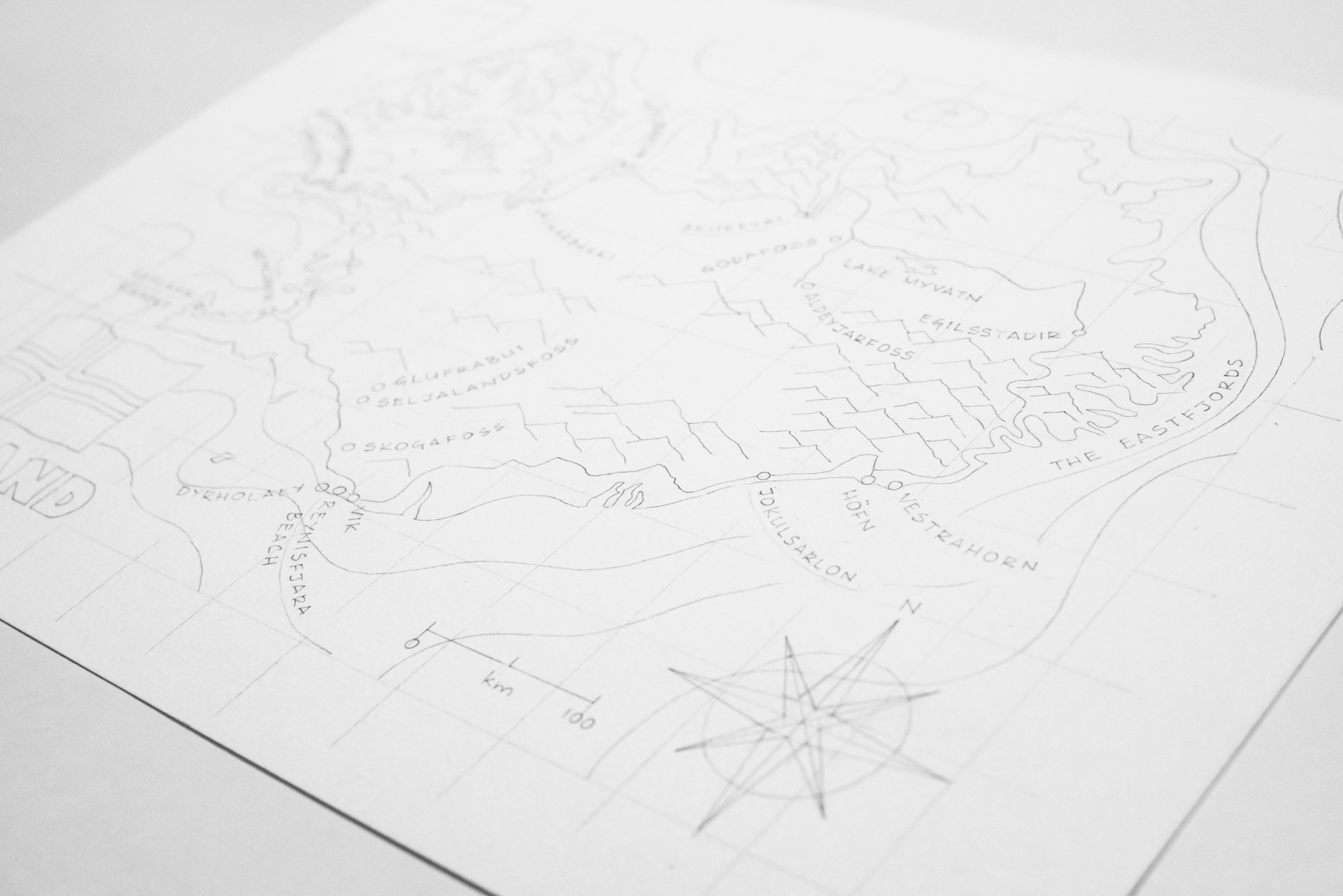
Next, I added the places we visited along the way, as well as some features to make the map more interesting. I also pencilled in some depth contours in the ocean to add more character.
I decided to use a light watercolour wash in blues and purples for the sea, and in earth tones for the land, leaving several areas in white to give the impression of snow cover. Next, I penned in the labels in simple block letters (if I do any more of this, I'm going to have to learn some calligraphy). To provide some perception of topography and depth, I decided to use stippling, an age-old tried and tested method I've used previously for pen and ink sketches, one that has extensively been used throughout history by artists and mapmakers alike, and is still used for imaging in just about everything from print media to currency notes. I love this technique, the slow, almost hypnotic manner in which it brings a picture to life, and the infinite care and patience it demands of the artist.

I used heavy (300 gsm) cold-pressed, fine-grain, acid-free paper for the watercolours
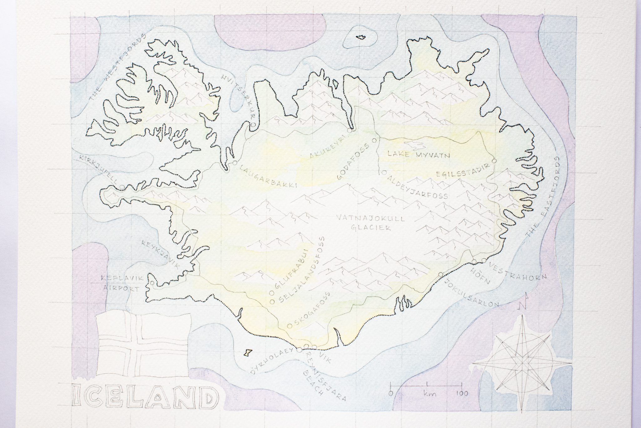
The watercolours are brushed in. It’s starting to come together!
To finish, I then coloured the Icelandic flag, the title, the distance scale and the compass. A few final touches and I was done! All that remained was for me to sign and date it. My personalised map of Iceland, from start to finish. The whole project, including the hours of reading and online research I did prior to starting on the actual drawing, took me about 100 fun-filled, gratifying hours. I'm already thinking of the next one!
Ta-da! It’s done! My hand-drawn custom map of Iceland.


